For my digital communication course in my Master’s in Technical Communication degree at the University of San Francisco, I was tasked with applying empathy and design thinking to help social justice causes for organizations in San Francisco.
Scroll below to see how I created a user persona and user journey map using Canva, user research, and existing data for CalFresh.
Portfolio pieces

Introduction
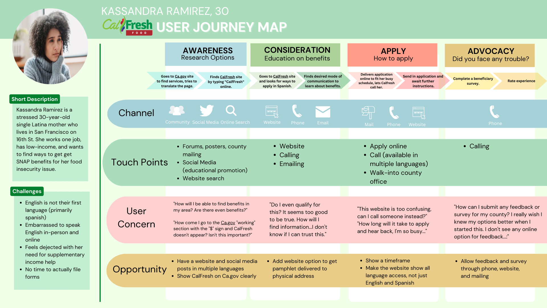
I chose to research CalFresh and create a user persona for a user journey map because CalFresh is a vital resource for many low-income households in San Francisco who need food support. Having worked with diverse communities in San Francisco to supply food and educate about resources, this was a very personal project for me.
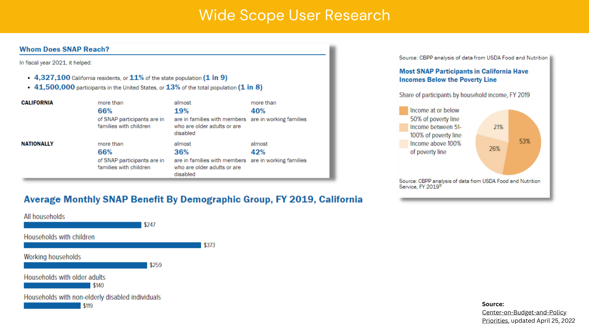
As seen in the data above, 53% of California residents fall at or below the poverty line; that’s highly problematic, and resources must be available for them to survive. I chose to highlight Kassandra Ramirez because multiple factors restrict her access to Calfresh: (1) language barrier, (2) accessibility, and (3) not tech-savvy. Looking at the big picture, I created a user persona, user journey map, and compiled research on CalFresh to help product teams and web designers understand and empathize with diverse communities and their unique struggles.
The problem
The core problem was that Kassandra did not know how to get benefits and what was available to her due to her lack of digital literacy and reluctance to speak to others about her financial struggles. As a result of limited physical promotional material, Kassandra was unaware that CalFresh existed. It does not help her situation that the CA.GOV website has many options that do not depict CalFresh in the menu items.

Once users find the CalFresh website, they do not have mailing options for receiving a pamphlet or other promotional material. The only options available are applying online, calling, and coming in. Kassandra does not want to speak to others during her consideration period and has no time during the day due to work and her family, so she needs a physical pamphlet mailed to her to meet her needs.

Project Roles:
Content Designer
User Experience Designer
Goals a user journey map would achieve:
Increase empathy for CalFresh households across user experience teams.
Understand how diverse audiences move through the CalFresh website and their unique struggles.
Validate the user’s expectations against their actual experience with CalFresh.
Optimize specific stages of the user journey.
The solution
For this project, I compiled research on how many households use CalFresh and studied the importance of understanding language barriers and accessibility in web design and communication. Then, I created a user persona to gather a concrete idea of Kassandra's identity. As the final step, I created a user journey map by exploring the CalFresh website and its application process to understand where Kassandra would face pain points.
The outcome
I successfully learned and created a user journey map for the entire CalFresh application process for users like Kassandra. As I created the map, I realized the struggles that Kassandra may face when analyzing the advocacy section of the map. If Kassandra wanted to report on her experience and any issues she may have faced, the website should anticipate this and empower her to do so.
Ultimately, the project deliverables will increase empathy and understanding for users like Kassandra. In doing so, more households will obtain the necessary food benefits to live more sustainably.
The data shows a core need for the CalFresh website to appear in Find a Service on CA.GOV, but it does not after over 30+ results. This results in a bad user experience and delays households from receiving benefits.
For example, the CalFrsh website lacks mailing options to learn about benefits in the user’s desired language.